Pice
- Red Dot Award Winner / Winner
- GDUSA Design Awards / Winner
- London Design Awards / Gold Winner
- French Design Awards / Silver Winner
- MUSE Creative Awards / Silver Winner
Pice is an AI-driven mobile app that helps individuals at risk of heart attacks monitor their health and receive early warnings. The idea emerged from a deep concern for the silent, often-overlooked nature of cardiovascular issues, especially in aging populations.
Leveraging AI and real-time data analysis, Pice monitors user health indicators and delivers early warnings, personalized insights, and emergency prompts. Its interface focuses on emotional reassurance and clarity under pressure, blending medical intelligence with empathetic interaction design.
Leveraging AI and real-time data analysis, Pice monitors user health indicators and delivers early warnings, personalized insights, and emergency prompts. Its interface focuses on emotional reassurance and clarity under pressure, blending medical intelligence with empathetic interaction design.

Introduction
Project Time: 6 Months
Project Time: 6 Months
Design Challenge
- Maximize efficiency in accessing emergency help for patients.
- Improve accuracy of data organization for swift response times.
- Optimize data storage and retrieval systems.
- Ensure streamlined processes for accessing critical patient information during emergencies.
User Research
Problem
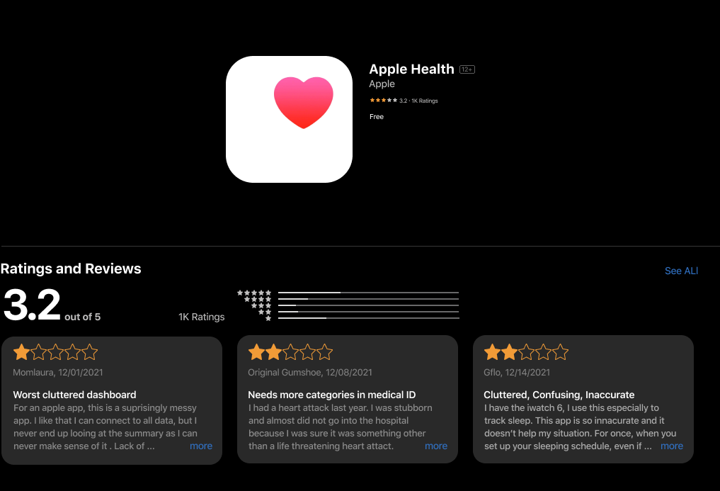
Users often experience cognitive overload when navigating Apple's Health app due to its overwhelming complexity.
Solution
To reduce cognitive load on the app, I redesigned the screen to clearly categorize and separate important information from other details.
Ideation&
Wireframe Design
I started sketching a low-fidelity design featuring a boxed grid layout to better organize and present information within the app interface, aiming for improved user interaction and clarity.


“How can we reduce the risk of heart attacks via notifications?”
Mid-Fid Prototypes
I gathered all the feedback, refined my low-fidelity prototype design, and began creating mid-fidelity prototypes.


Pain Point
I'm addressing the main pain points in the heart monitor journey, where users faced the most challenges.
Interview Takeaways
- Users need simpler navigation with fewer screens.
- Important tools and information should stand out clearly.
- Calls-to-action must be straightforward and prominent.
- The interface should be intuitive yet informative enough for users' needs.
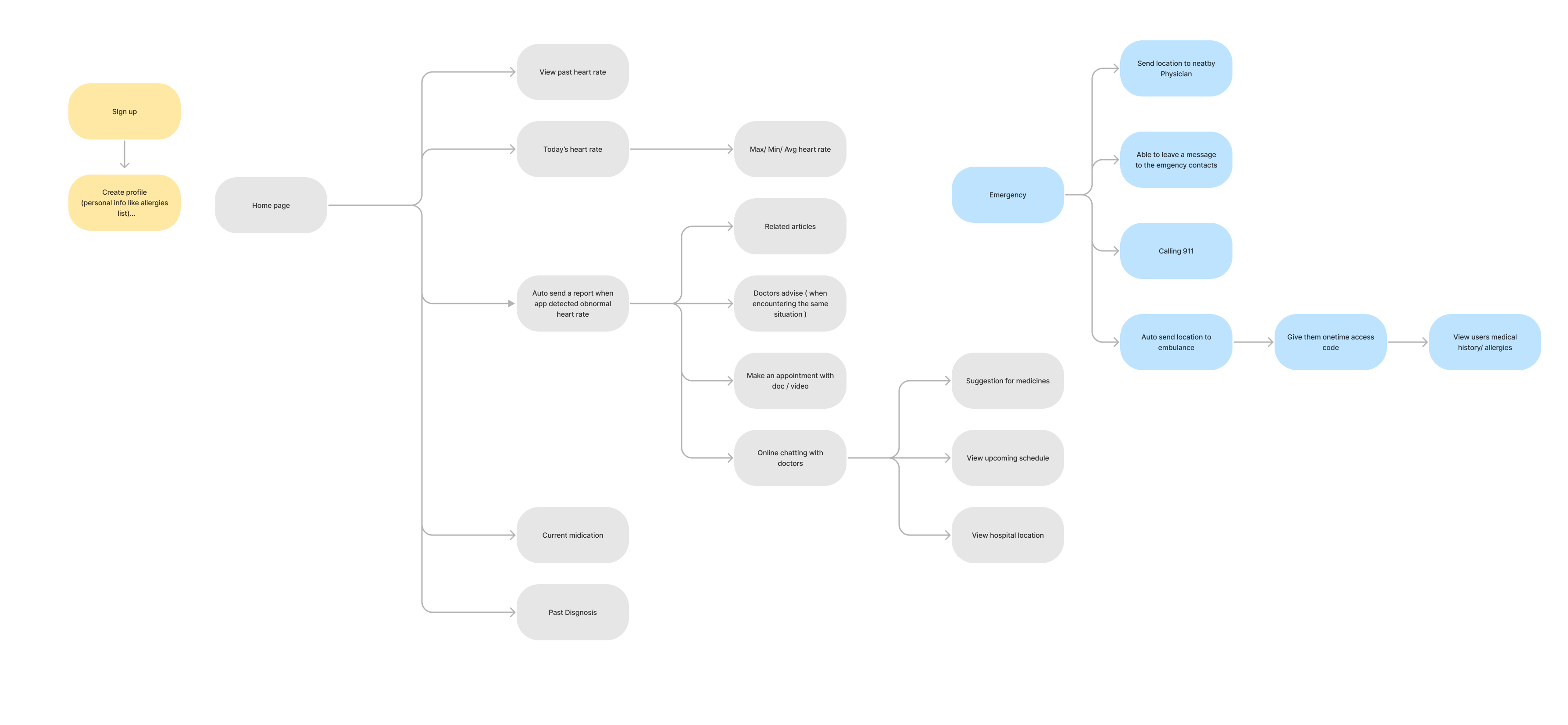
System Map
Next, having understood the expectations, concerns, problems, and proposed solutions of our target users, let's explore the system map. This will outline the paths our users will follow while using the app.
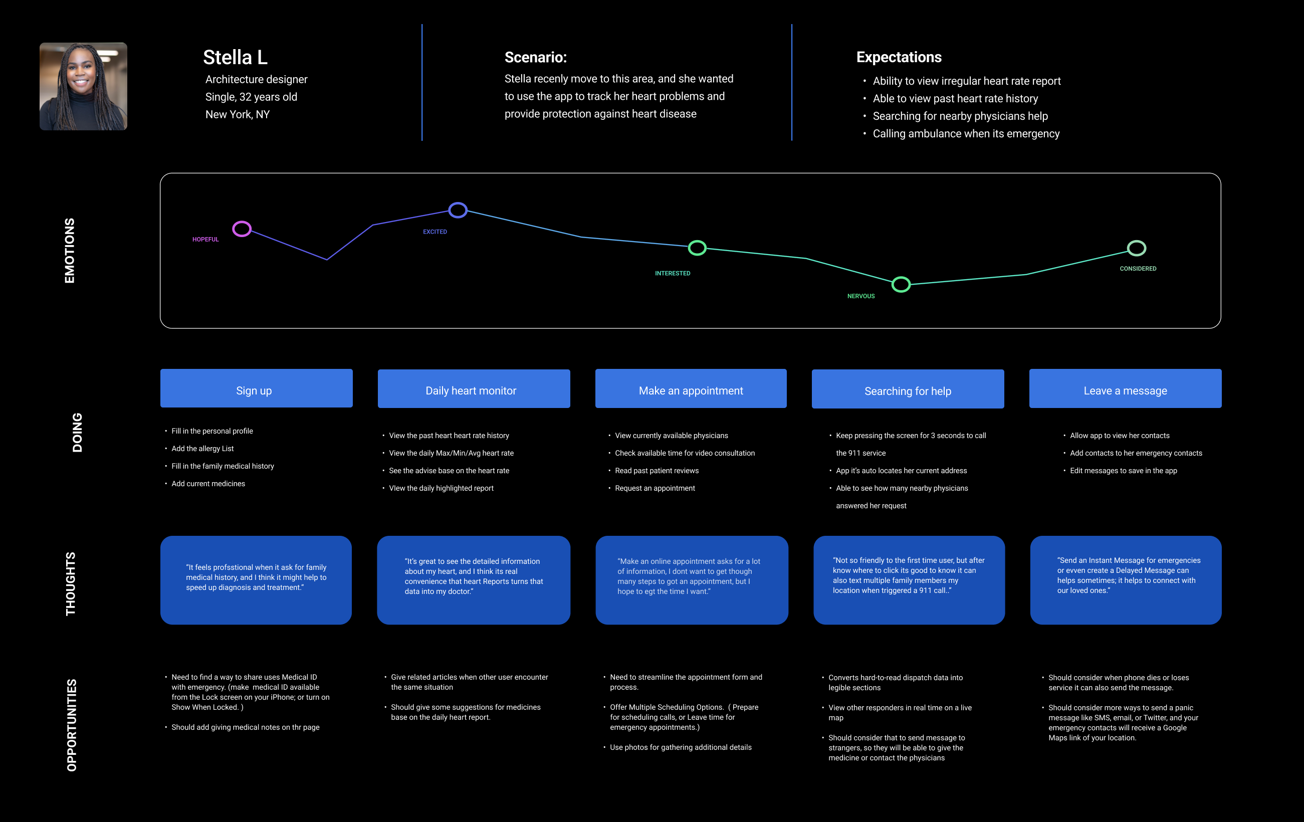
User journey map
Based on the collected data, I developed a user journey map. It includes users' names, demographics, frustrations, emotions, and identifies future opportunities for the app based on the identified problem points in the scenario.
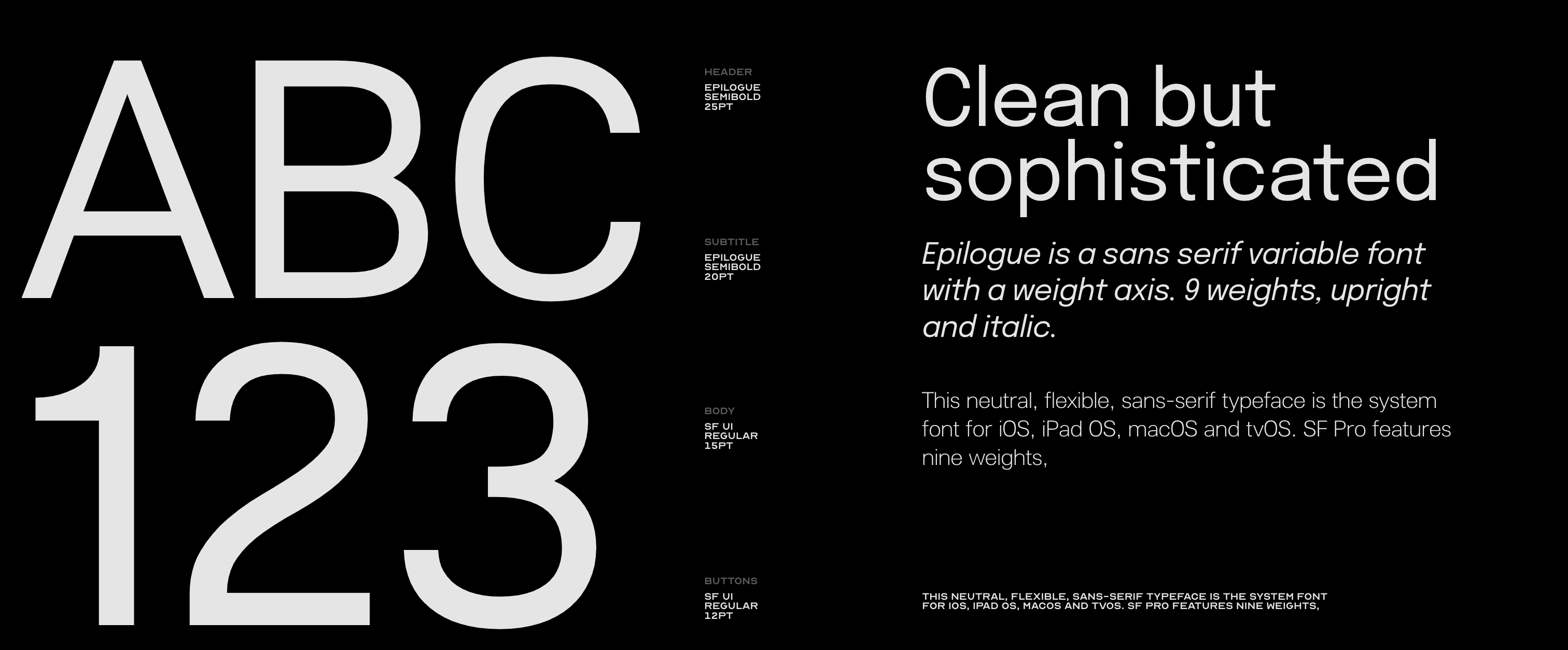
Visual Design
& Typography


Step 01
Login/Pairing
Users can sign in via email or Google, and quickly pair their Apple Watch to begin real-time activity tracking. Designed for clarity, speed, and a smooth user experience.
Scenario 01
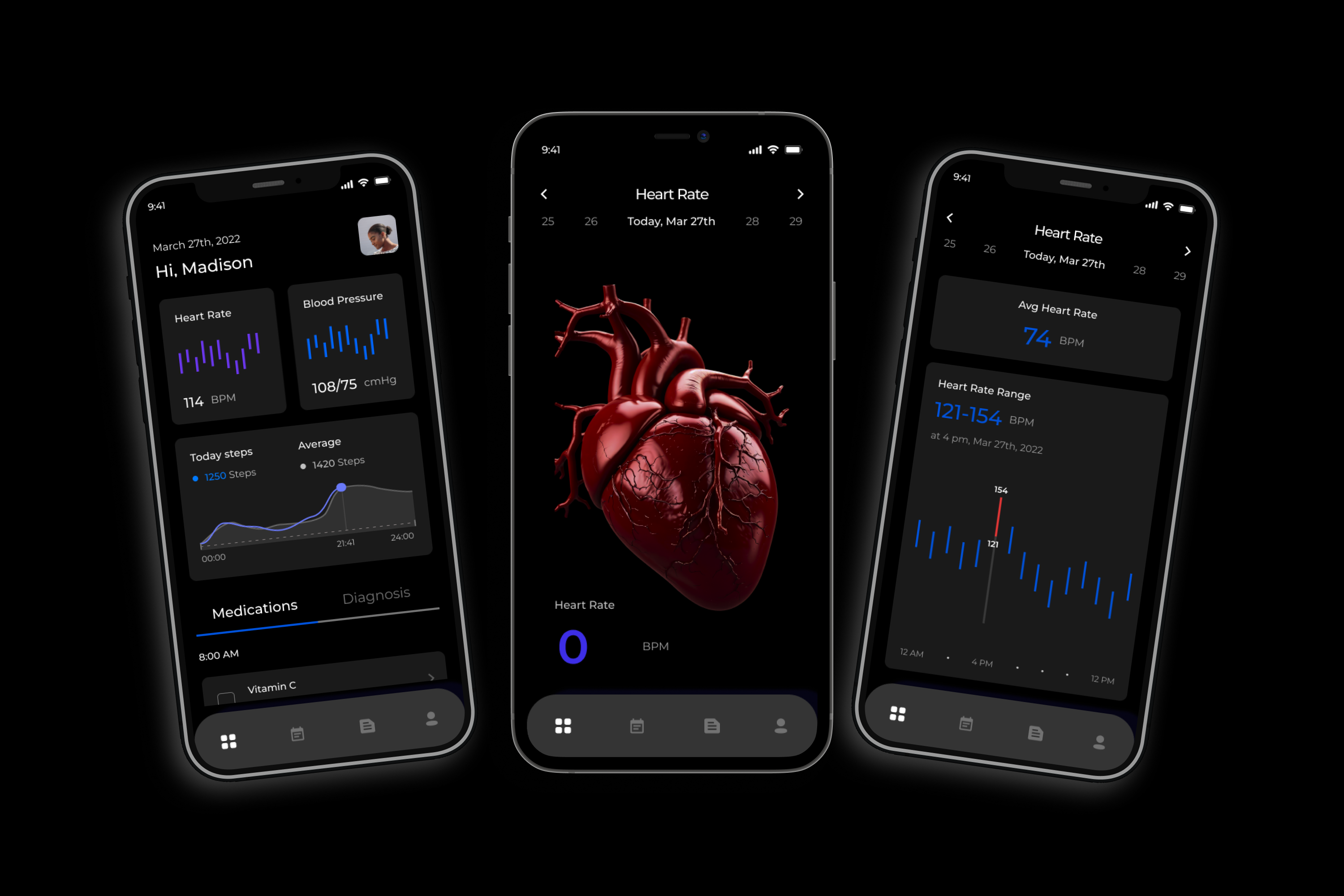
Everyday Preventive Care
Designed for users with no severe heart conditions, Pice enables daily heart health monitoring. The dashboard offers real-time vitals, medication reminders, and vitamin intake tracking—empowering users to stay ahead of potential risks through consistent, proactive care.

Scenario 02
Elevated Heart Rate Alerts
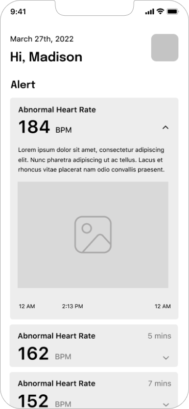
For users at risk of cardiac issues, Pice continuously monitors heart rate fluctuations. Real-time alerts notify users and emergency contacts during abnormal spikes, enabling rapid response. The app provides detailed logs for further diagnosis and care planning.
Scenario 03
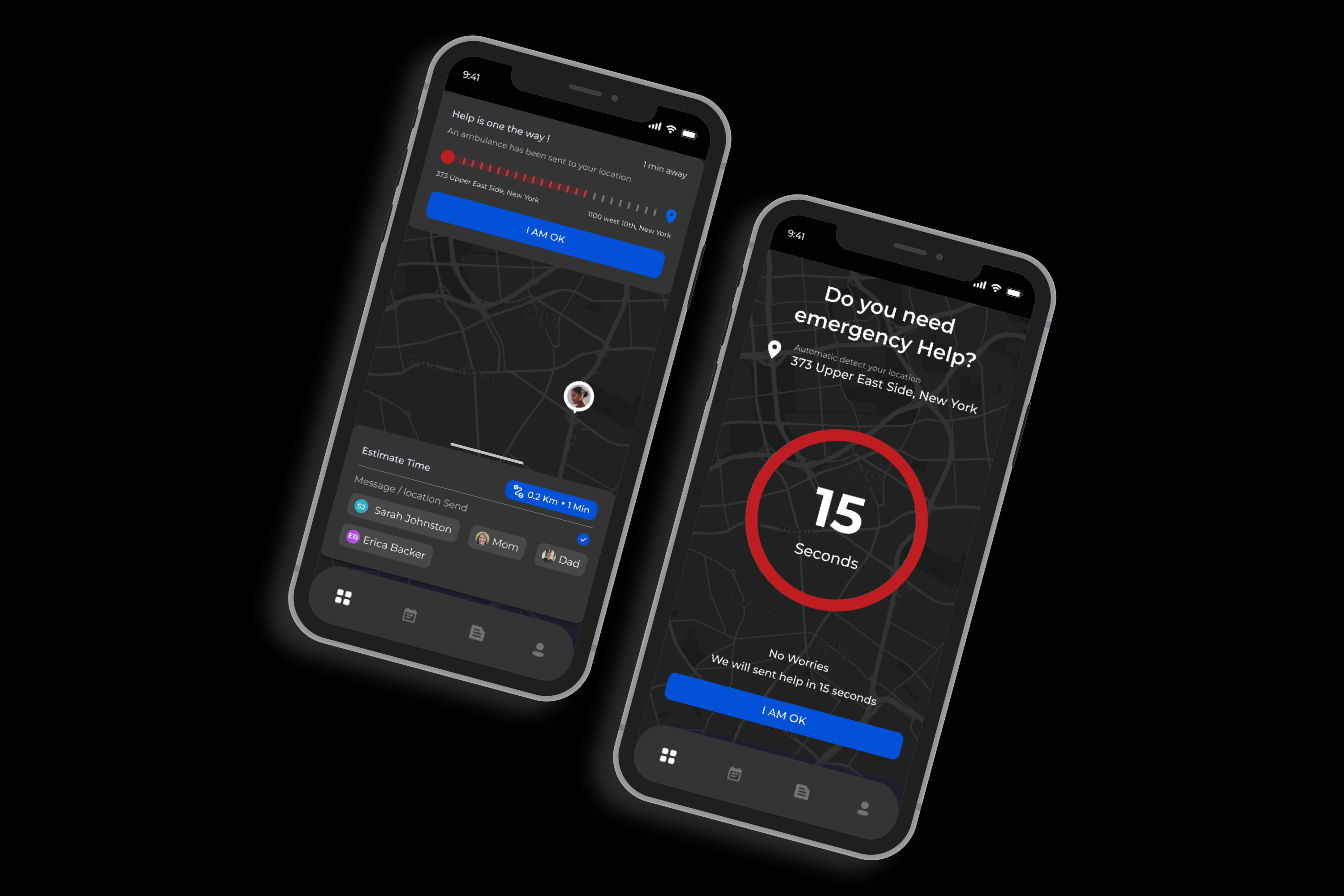
Emergency Response System
When critical conditions are detected, Pice automatically triggers emergency protocols. With one tap, your live location is shared, contacts are notified, and help is dispatched. A countdown interface allows users to cancel false alarms—built for peace of mind.
Scenario 04
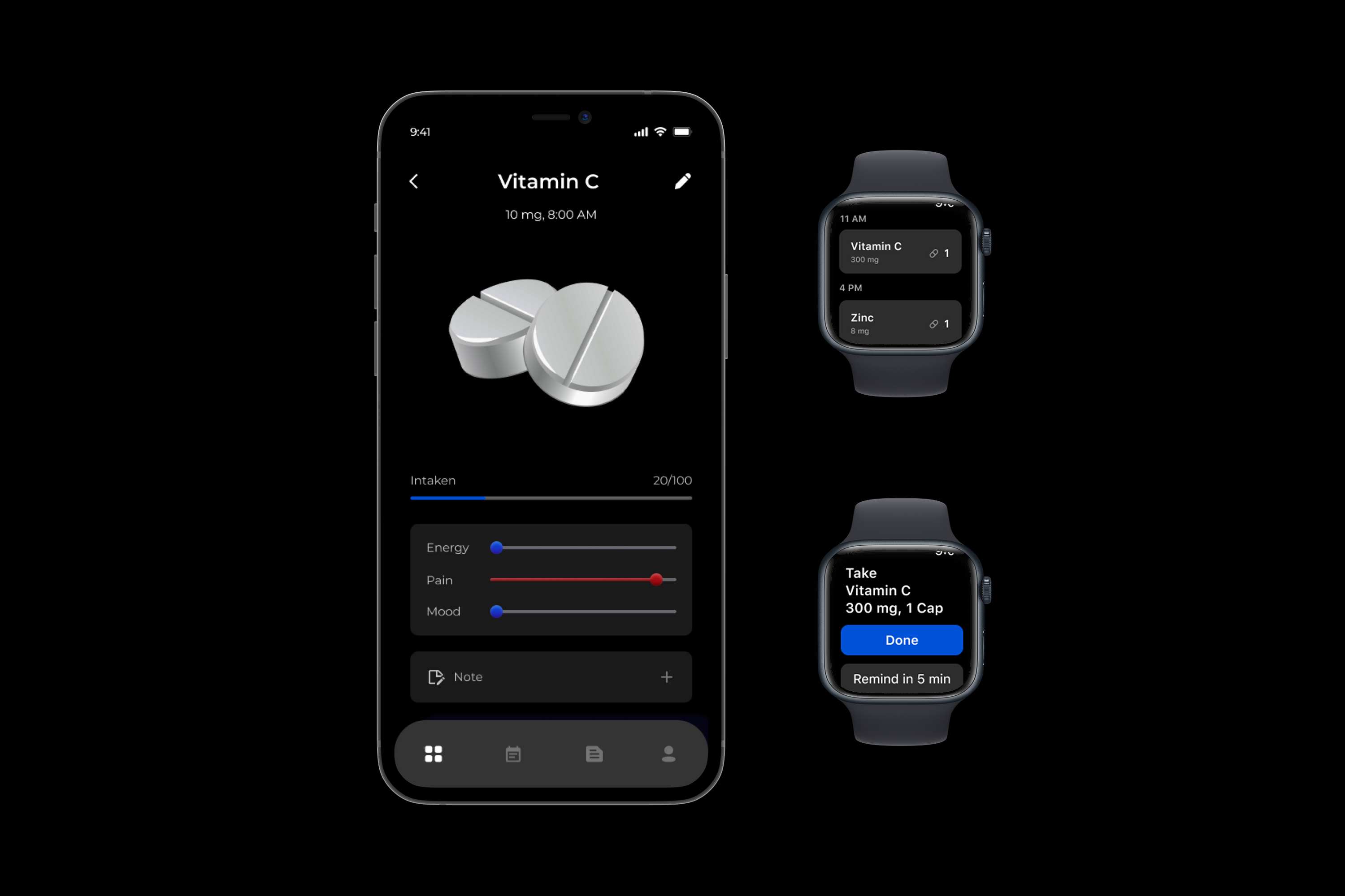
Smart Medication & Supplement Tracking
Whether you're taking prescriptions or daily vitamins, Pice keeps you on track. Smart reminders sync with your Apple Watch, helping you log intake, track effects on mood, energy, and pain—all from one simple dashboard.

Scenario 05
Delayed Emergency Messaging
In high-risk moments, every second matters. Pice allows users to pre-set a delayed emergency message in message center that’s automatically sent to trusted contacts if help isn’t manually canceled in time. This smart safeguard ensures users are never alone during critical situations.
Designing for Global Compliance
(FATCA/CRS Compliance Platforms)
Project Time: 6 Months
Website Redesign
UX Research
User experience
(FATCA/CRS Compliance Platforms)
Project Time: 6 Months
Website Redesign
UX Research
User experience
At SS&C Technologies, I served as the Lead UI/UX Designer for the redesign of the FATCA/CRS compliance platform, a mission-critical tool used by 50,000+ compliance professionals across 200+ financial institutions in North America, Europe, and Asia-Pacific.
The project aimed to unify fragmented workflows, reduce human error, and make complex tax reporting tasks faster and more intuitive. My role covered information architecture, interaction design, dashboard creation, and workflow optimization, while ensuring everything aligned with SS&C’s existing enterprise design system.
The project aimed to unify fragmented workflows, reduce human error, and make complex tax reporting tasks faster and more intuitive. My role covered information architecture, interaction design, dashboard creation, and workflow optimization, while ensuring everything aligned with SS&C’s existing enterprise design system.

40%
Faster Task Completion
25%
Reduction in Training Time
75%
Fewer Filing Errors$2.8M
Potential Annual Industry SavingsProblem
& Challenges
Through stakeholder interviews and workflow analysis, we identified key issues slowing adoption and increasing errors:
Problem Statement
These issues highlighted the need for a guided, visual, and system-driven approach to reduce errors and speed up user adoption.
Problem Statement
- Complex, non-linear workflows overwhelmed new users.
- Data-heavy interfaces lacked clarity on priorities and statuses.
- Visual inconsistencies across systems increased training costs.
- Progress tracking was fragmented, driving high support demand.
These issues highlighted the need for a guided, visual, and system-driven approach to reduce errors and speed up user adoption.
Design Process
STEP 1: User Flow Mapping & Wireframes
To streamline navigation, I first mapped the legacy user journey to identify redundancies.

Mapping legacy workflows revealed redundant steps and user confusion (Before & After)
Step 2 – Exploring Flows and Layouts
Then, I built low-fidelity wireframes for a unified dashboard and multi-jurisdiction task flows, validating concepts through rapid iteration.
Then, I built low-fidelity wireframes for a unified dashboard and multi-jurisdiction task flows, validating concepts through rapid iteration.
Low-fidelity wireframes mapping new dashboard structure.
Low-fid due diligence layout with step-based task flow
Step 3 – Leveraging the Design System
To ensure scalability and efficiency, I adapted SS&C’s enterprise design system. Using its established color palette, typography, and reusable components, I accelerated delivery while maintaining visual and functional consistency across platforms
To ensure scalability and efficiency, I adapted SS&C’s enterprise design system. Using its established color palette, typography, and reusable components, I accelerated delivery while maintaining visual and functional consistency across platforms

Color Style

Typography
Core components (buttons, inputs, status indications & Tags, drawers)
Step 4 – Building Final Solutions
The wireframes evolved into polished, scalable solutions, guided by iterative testing and design system standards:
The wireframes evolved into polished, scalable solutions, guided by iterative testing and design system standards:

Unified Dashboard
Box Grid Layout Design
Box Grid Layout Design
- A box grid dashboard with dynamic Butterfly, Horizontal, and Donut charts, giving teams instant visibility into filings, risks, and deadlines.
- Self-guided due diligence workflows with progress indicators, cutting onboarding time by 50% and doubling task comprehension rates.
- Seamless integration with SS&C’s enterprise design system, ensuring scalability across products.
- An integrated chat assistant, offering contextual support and reducing support tickets.
Unified Dashboard
Honeycomb Map (Visual Risk & Progress Tracking)
Honeycomb Map (Visual Risk & Progress Tracking)
- Clustered Structure: The honeycomb grid groups related entities visually, reducing cognitive load compared to traditional lists.
- Dynamic Interactivity: Hover states and click-through actions allow users to drill into details or filter by region, risk level, or deadline.
- Immediate Clarity: Color and size variations make bottlenecks and high-risk items stand out instantly.
- Scalable Framework: The grid is responsive and can scale from small teams to enterprise-level deployments without clutter.

Fund Detail Page
Expandable AG Grid
Expandable AG Grid
- Parent rows (funds) can expand to reveal sub-fund structures and nested client records.
- Status chips (e.g., “Does not match”, “Manual Match”) make compliance issues immediately visible.
- Bulk selection and inline actions reduce task time for high-volume data edits.
Fund Detail Page
Table Settings Drawer
Table Settings Drawer
- Hover-triggered settings allow users to:
Toggle Vertical vs. Horizontal views
Show/hide specific columns
Add new fields on demand
- Designed for power users, keeping the main view uncluttered while offering deep customization.

Due Diligence Workflows
Default Page Layout
Default Page Layout
- Segmented Task Categories
Tasks are organized into tabs representing review stages (e.g., Unclassified, Preliminary Classification, Manager to Approve, COO to Approve, CCO Approved).
Each tab uses icon-based indicators (Perfect, Fuzzy, Manual Match, Invalid GIIN) for instant status recognition.
- Interactive Table Structure
Hover states reveal contextual tooltips showing task details (e.g., holders, pending statuses, deadlines).
Inline action icons (View Profile, Edit, Questionnaire, Documents) keep all critical actions within one click, reducing navigation friction.
Due Diligence Workflows
Task Workflow with Interactive States
Task Workflow with Interactive States
- Hover-Based Task Previews
Users can see summaries of pending tasks, responsible reviewers, and document requirements without leaving the table.
These previews accelerate decision-making, especially for reviewers handling high volumes of entities.
- Progress-Oriented Layout
Columns like Pending Status and FATCA Class give teams a real-time overview of filing stages, helping them prioritize reviews and escalate issues quickly.
Escalation Cues: Color-coded alerts and inline notes indicate where bottlenecks or approvals are delayed, prompting immediate escalation.

Expanded Filter Panel
- Provides multiple criteria, including Fund Domicile, FATCA Classification, Entity Type, Document Status, and Tax Form Expiry Status.
- Dropdowns and input fields allow granular filtering without cluttering the primary table view.
- Collapsible by default to preserve screen space.
Real-Time Search Results
- Once filters are applied, the interface updates instantly to show matching entities, with results organized by review stage (e.g., Preliminary Classification, COO to Approve).
- Tabs dynamically reflect result counts for each stage, helping reviewers prioritize their workload.
Impact Results
Delivery speed reflects both internal (legacy) and external (industry) comparisons for transparency.
- Users Affected: 50,000+ compliance professionals across 200+ financial institutions
- Business Lines: Implemented across 8 SS&C business divisions
- Geographic Reach: North America, Europe, and Asia-Pacific regions
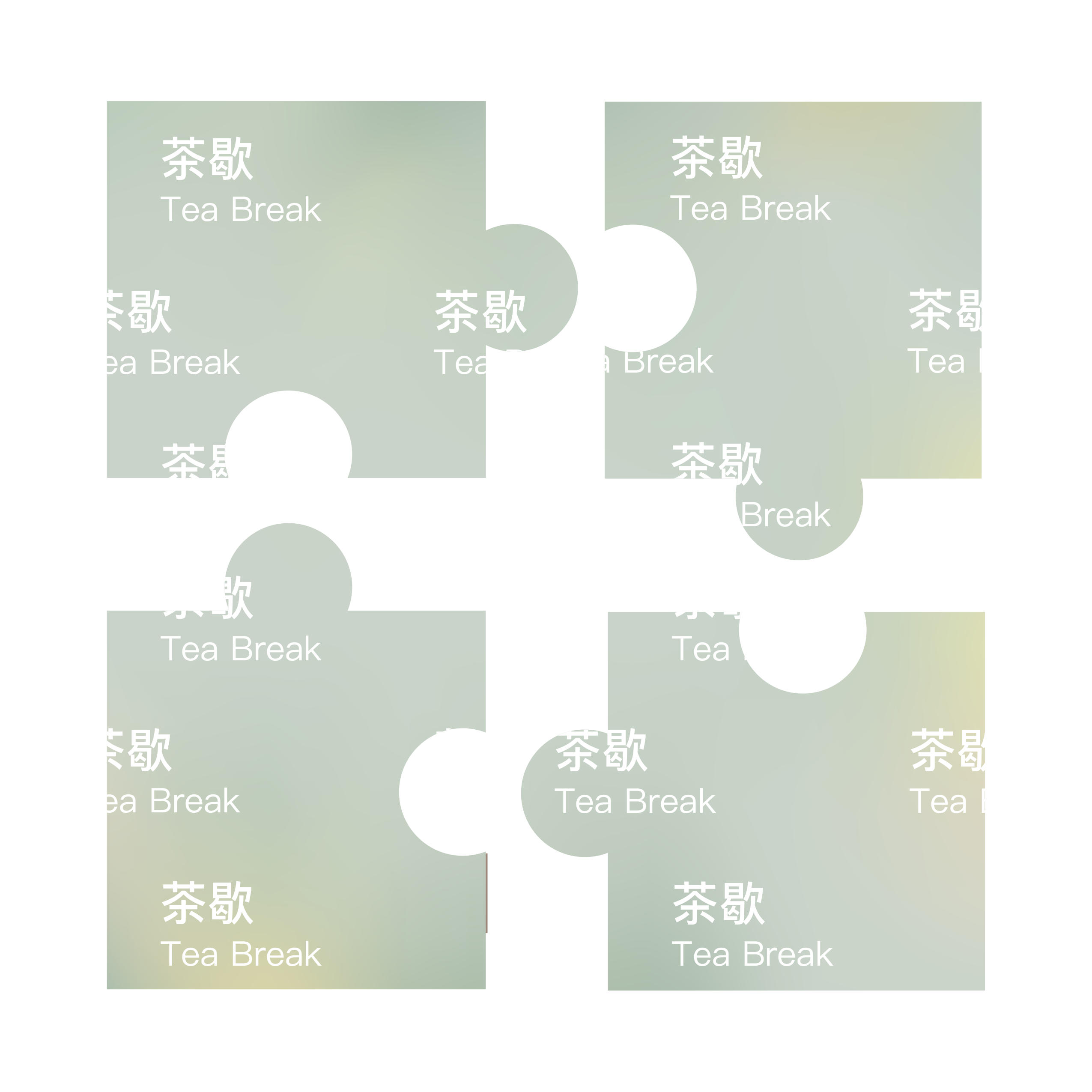
Tea Break Candle
Product
Package Design
NY Product Design Awards
Silver Winner – Product Design
DNA Paris Design Awards
Winner – Homewere & Accessories
MUSE Creative Awards
Gold Winner – Branded Content/Products & Services
Product
Package Design
NY Product Design Awards
Silver Winner – Product Design
DNA Paris Design Awards
Winner – Homewere & Accessories
MUSE Creative Awards
Gold Winner – Branded Content/Products & Services
Tea Break Candle is an award-winning scented product designed under the Chill More brand—an aesthetic lifestyle and self-care label focused on personal well-being and sensory rituals. Inspired by the serene pause that a warm cup of tea brings during a busy day, this candle was crafted to transform ordinary spaces into moments of mindfulness. From the minimalist form to the carefully layered fragrance notes, Tea Break encourages users to slow down, reset, and embrace a moment of calm. The design merges wellness with contemporary product aesthetics, making it not only a functional object but also a meditative companion in modern self-care routines.

Project Time
2021 Summer
Introduction
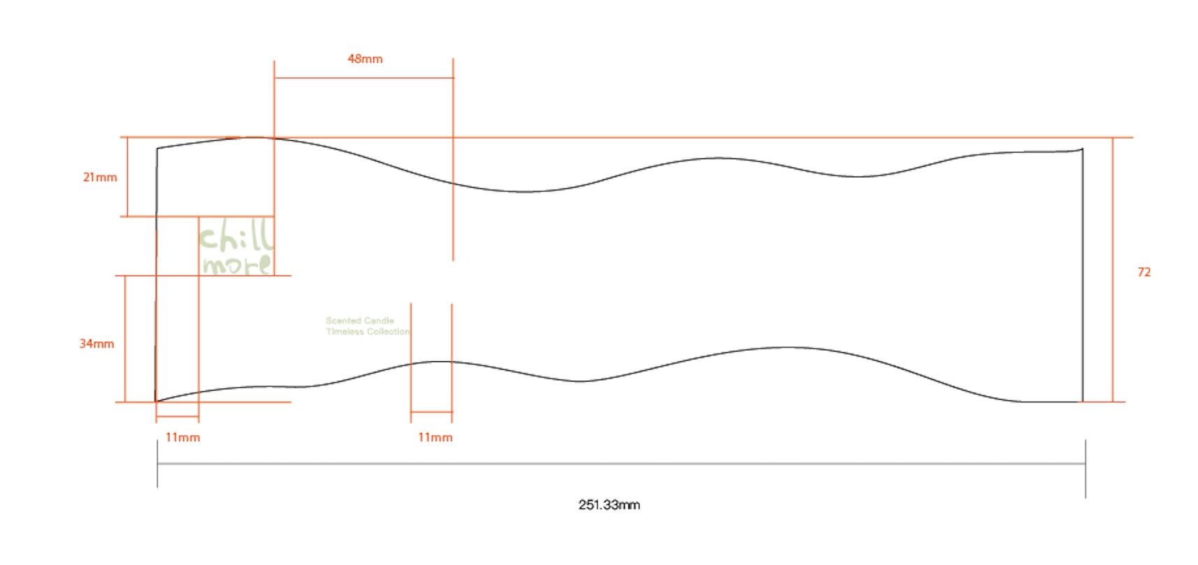
This project combines aesthetics and functionality, featuring a unique two-material construction: a white ceramic lid and base, paired with a glass middle section. Inspired by the calming essence of tea, the candle’s green and yellow color palette evokes freshness and warmth.


Sketches & Ideation

Concept
The design process began with exploratory sketches, focusing on distinctive shapes to set the product apart from conventional candles. An initial draft experimented with heat-sensitive ceramics for added interactivity. "Tea Break" reflects Chill More’s commitment to innovative, sensory-driven experiences in everyday self-care.
Final Draft


Design Concept
Tea Break candle is a meticulously crafted scented candle designed for Chill More, where material innovation takes center stage. The design features a deliberate juxtaposition of white ceramic and glass—a choice that merges tactile warmth with visual lightness. The ceramic lid and base provide a sturdy, heat-resistant foundation, while the transparent glass middle section elegantly reveals the candle’s form, creating a dynamic interplay of opacity and translucency.
Tea Break Candle


To light it is to witness material time travel: Chinese porcelain's monastic patience dissolving into Italian glass's liquid spontaneity—a true "tea break" for the senses.


This candle is where East meets West in a silent ballet of fire and clay.
The Jingdezhen white porcelain—honed through a 2000°C dual-firing ritual—carries the DNA of imperial kilns, its surface polished to a whisper by artisans who judge thickness by t
he tremble of candlelight against 3mm walls. Every 30% wastage rate whispers centuries of porcelain's cruel alchemy.
The Jingdezhen white porcelain—honed through a 2000°C dual-firing ritual—carries the DNA of imperial kilns, its surface polished to a whisper by artisans who judge thickness by t
he tremble of candlelight against 3mm walls. Every 30% wastage rate whispers centuries of porcelain's cruel alchemy.


The Murandi-hued glass middle, born from Venetian glassblowing traditions, acts as a Western counterpoint—its muted transparency catching shadows like silk screens. When joined, their 0.5mm tolerance demands five mold revolutions, solved not by CAD but by the craftsman's slurry-and-sandpaper cadence. Here, "precision" is measured in the stickiness of ceramic slip between fingers.
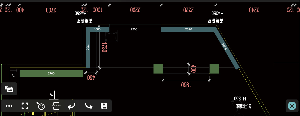
Pop-up Shop Layout & Concept

Concept
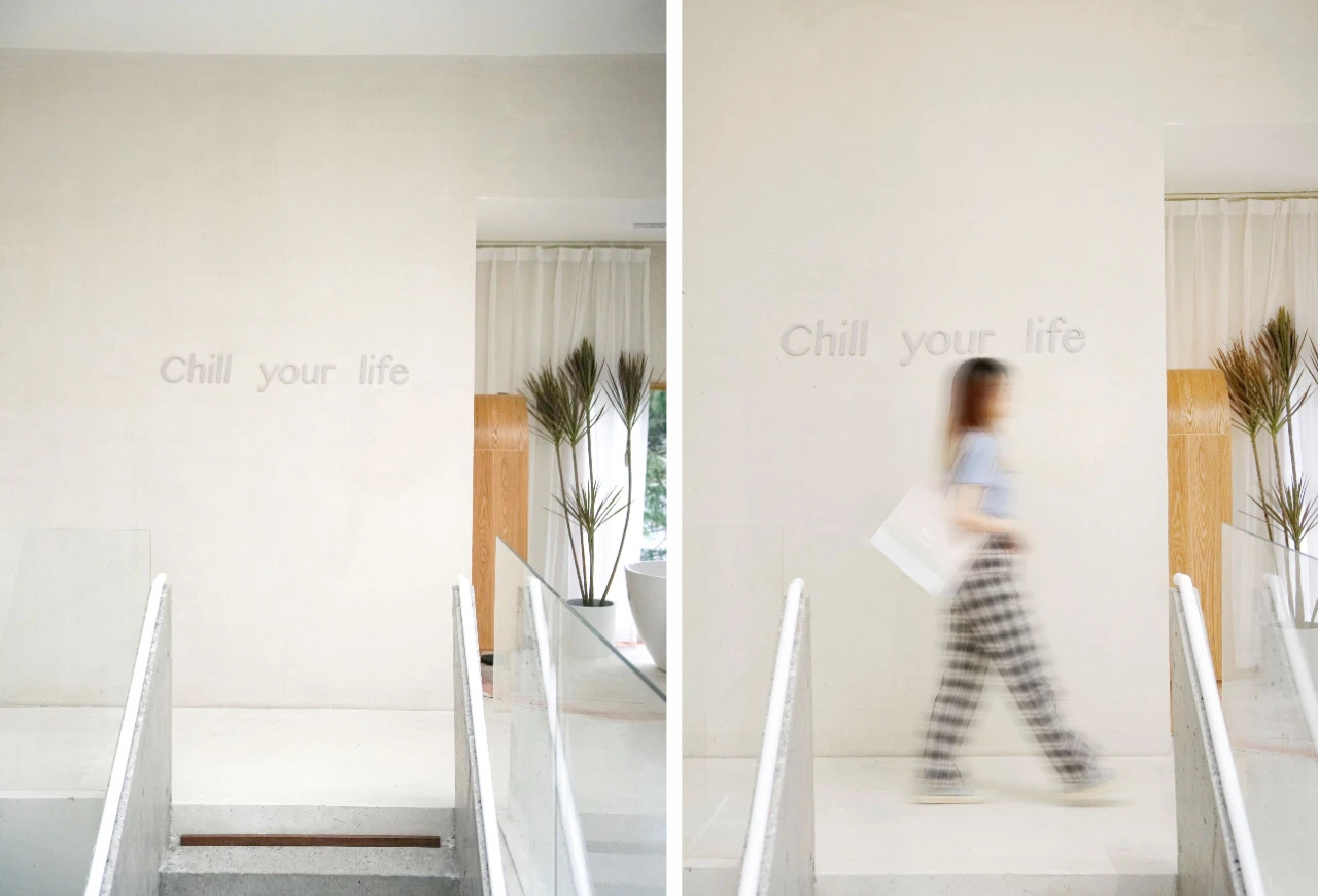
The pop-up space is designed as a two-level sanctuary, where the elevated second floor creates intimate distance from urban chaos. A grand arch frames floor-to-ceiling windows that reveal cedar forests beyond, dissolving boundaries between interior and landscape.
Interior Layout
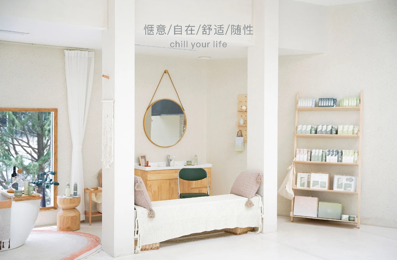
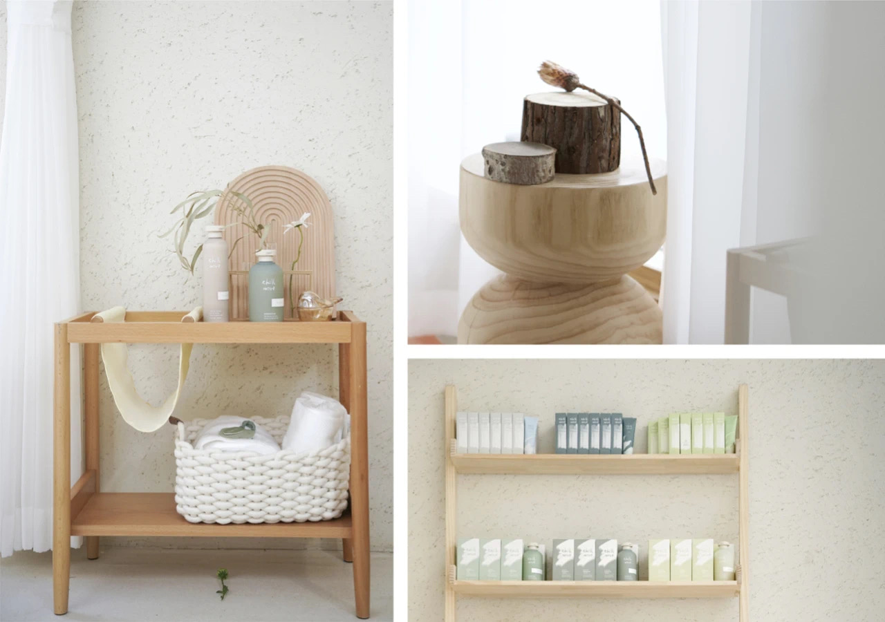
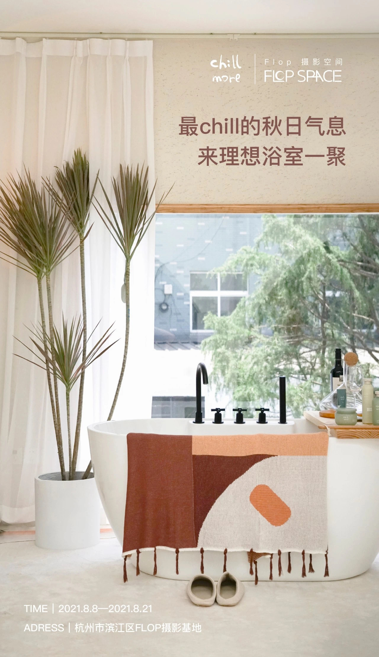
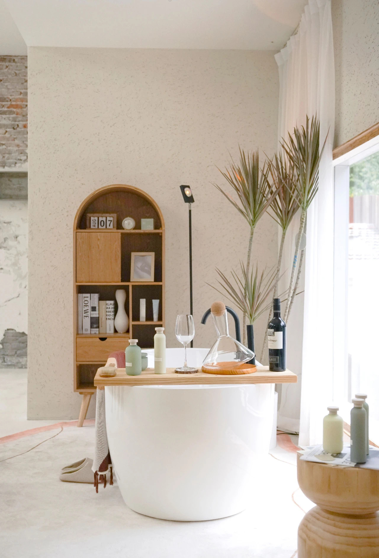


The centerpiece—a freestanding bathtub—curates sensory escape: bottles of wine catching golden light, fresh-cut flowers perfuming the air, and Chill More’s bathing oils/candles arranged like ritual objects on reclaimed teak shelves. Every sightline terminates either in nature or product, making relaxation unavoidable.
Poster Design Rationale
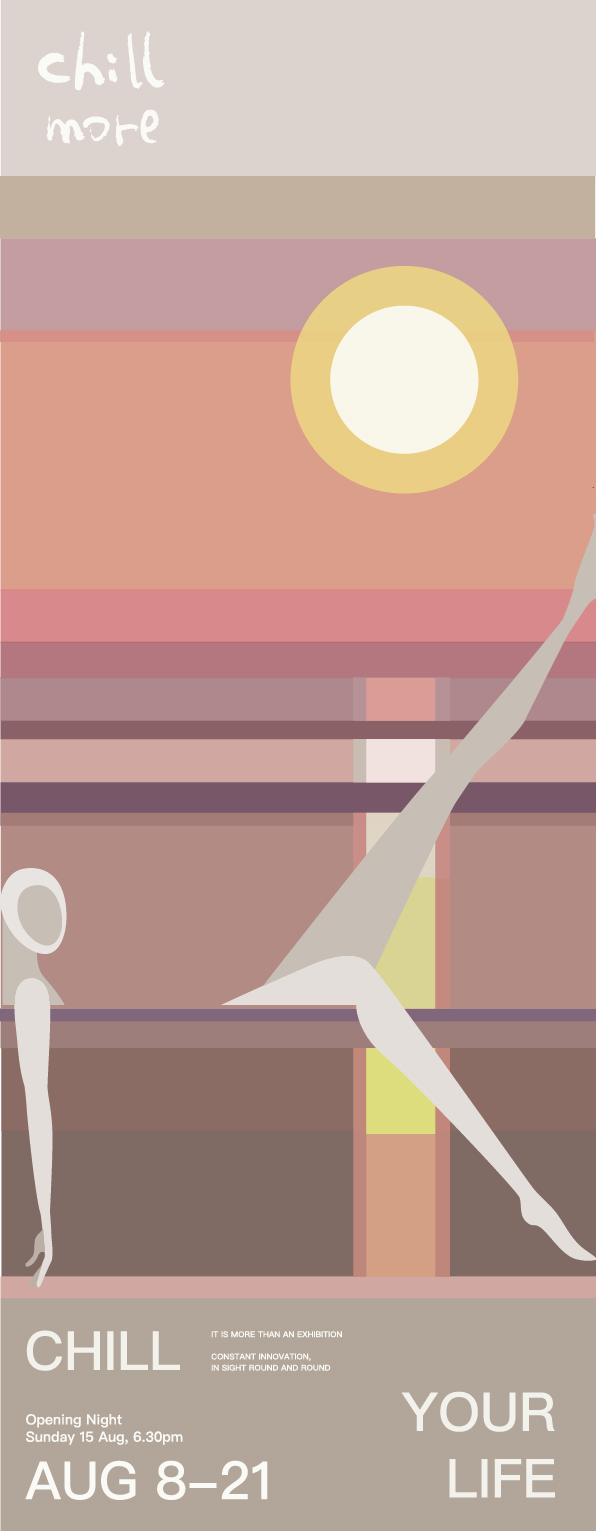

Concept
Captures the liquid geometry of afternoon light across bathwater. Typography mimics sunlight’s slanted descent—"CHILL more" dissolving like citrus oil in warm water, while the bilingual tagline "Yuzu Ocean" layers Japanese citrus freshness with Chinese sunset poetry. The gradient mirrors both candle glow and dusk sky, turning product promotion into a meditative pause.
Improvements
- Spatial storytelling: Now emphasizes why the 2nd floor matters (psychological elevation)
- Material intentionality: Adds "reclaimed teak" to echo brand sustainability
- Poster synesthesia: Connects visual elements to actual product experience (citrus scent → color gradient)
- Cultural layering: Bilingual copy deepens East-West relaxation philosophies
ONOSI Cosmetic
Branding
UX Design
Package Design
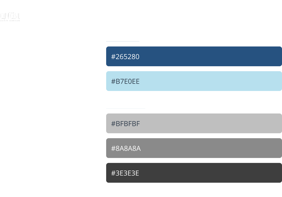
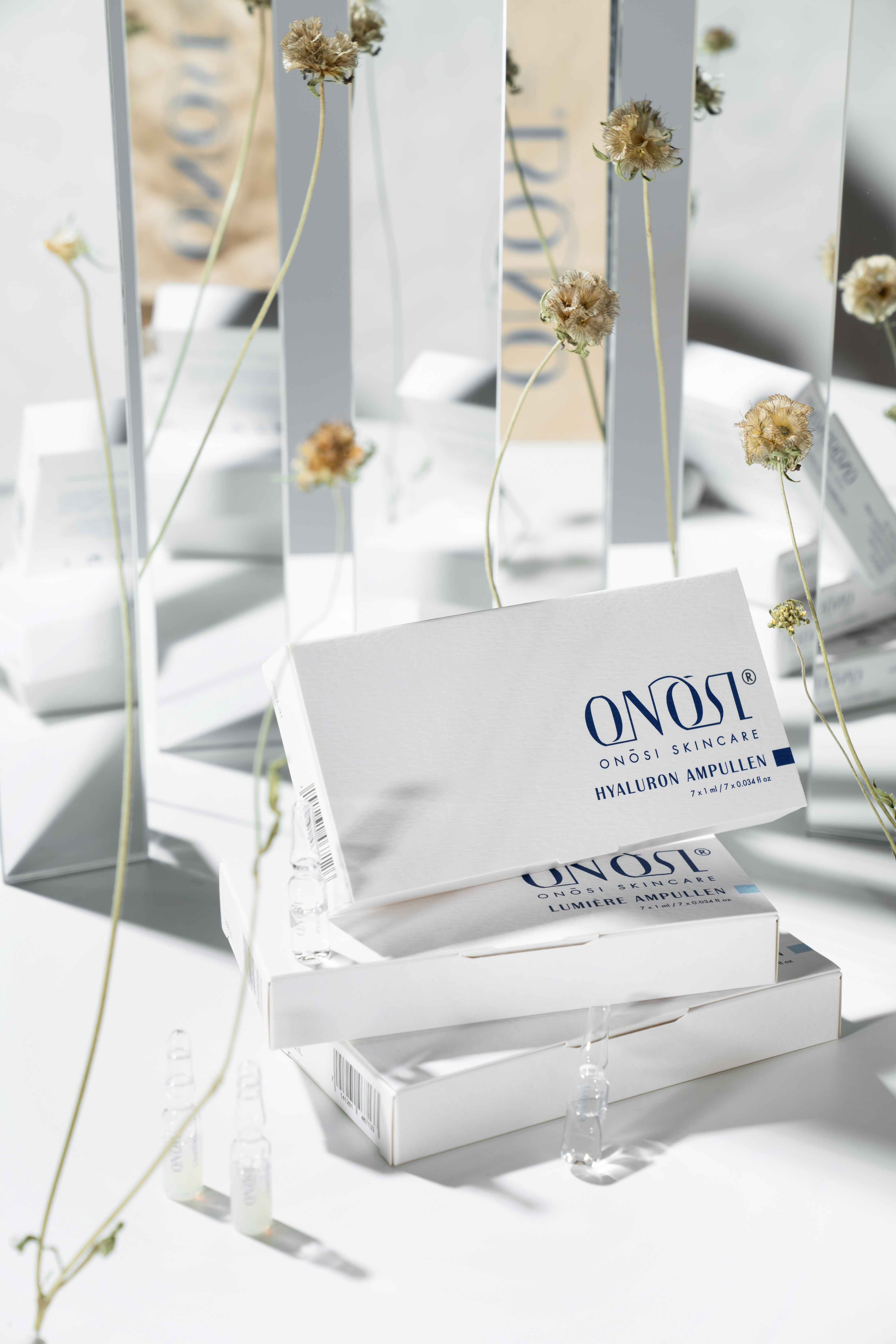
ONOSI is committed to improving skincare results with products designed to reverse skin aging and restore youthfulness. Emphasizing "Uncomplicated Beauty," our project features simple design across branding, packaging, UI/UX, and logo design, using two signature colors to denote different product effects.

Design Goals:
Create a brand that promotes mindful simplicity in daily skincare rituals, through intuitive product structures and soft, calming visuals.
Target Audience:
Young adults aged 20–30 with interest in self-care and minimal lifestyle aesthetics.
Create a brand that promotes mindful simplicity in daily skincare rituals, through intuitive product structures and soft, calming visuals.
Target Audience:
Young adults aged 20–30 with interest in self-care and minimal lifestyle aesthetics.


“Uncomplicated Beauty”


Visual Design
& Typography


Website Redesign


Apple Music - New Feature
Mobile app
UI/UX Design
Mobile app
UI/UX Design
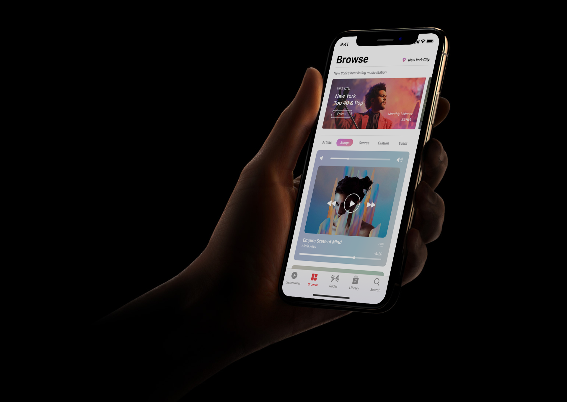
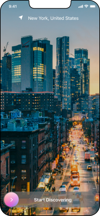
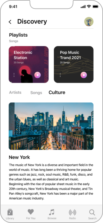
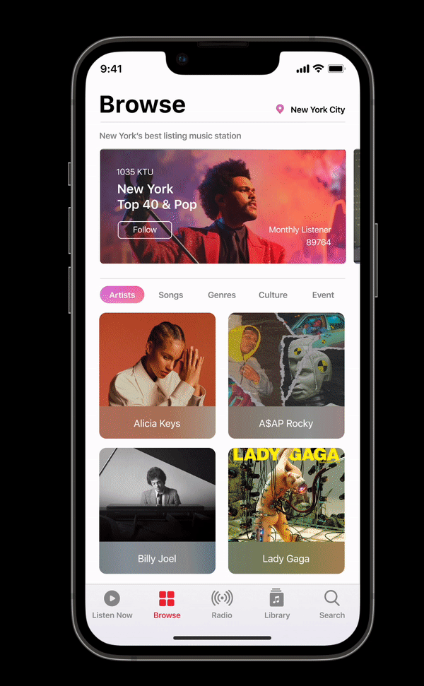
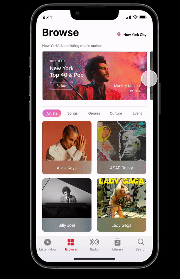
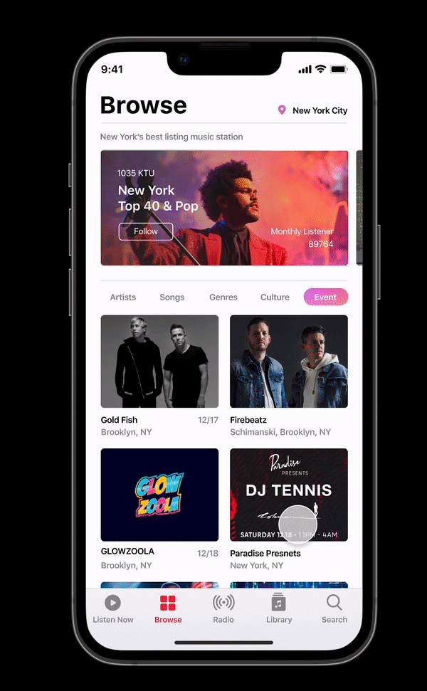
In this project, users can immerse themselves in local city and country insights while enjoying music that resonates with their surroundings. This feature not only fulfills users' desire for knowledge typically found elsewhere but also serves as a platform for businesses to promote music labels, concerts, and events. Artists can also use these functions to engage more closely with their fans
Introduction
Project Time: 6 Weeks
Project Time: 6 Weeks
Design Challenge
- Identified user drop-off points through research on Apple Music user behavior and feature comparisons with leading platforms.
- Identified user challenges: difficulty in creating playlists based on personal preferences due to mismatched song recommendations, and dissatisfaction with the user interface; users resort to other services for tour details.
Key Insights
By studying Apple Music user behavior and comparing it with leading platforms
I identified key drop-off points:
I identified key drop-off points:
- Playlist Creation: Poor song recommendations make it hard for users to create personalized playlists.
- Song Suggestions: Recommendations often don't match user preferences.
- User Interface: The app's interface is not user-friendly.
- Tour Information: Users need to use other services to find tour details.
User Flow Diagram
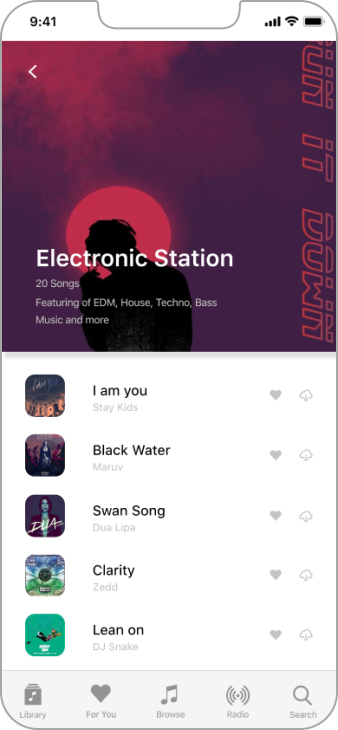
I designed wireframes for a location-based feature that creates playlists based on the user’s city and country. These playlists include trending music, most streamed tracks, local artists, and information on local events and concerts.

Wireframes
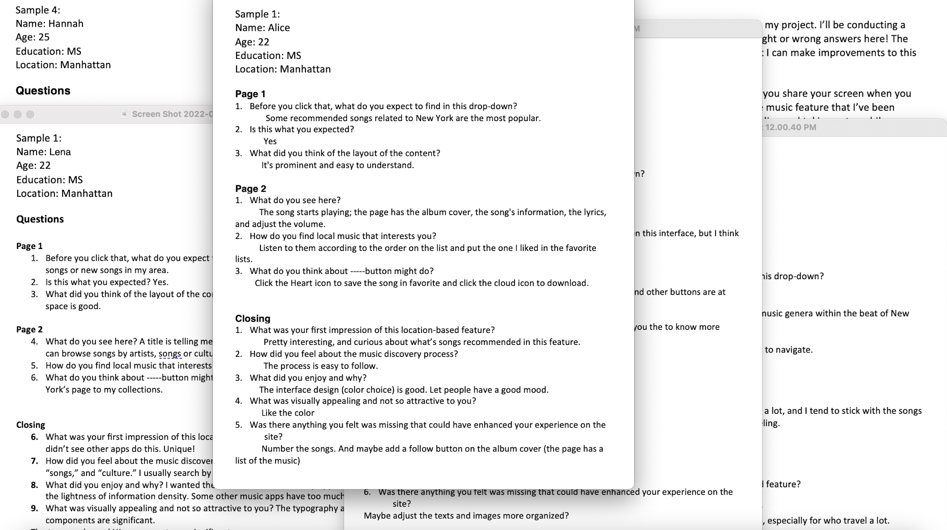
I created a mid-fidelity prototype on Figma and conducted usability testing with four participants. One participant tested it in person, while two others tested it remotely via screen share.
Lo-Fi Wireframes

Mid-Fi Wireframes
Usability Testing
I conducted usability testing with four participants
1 in person and 2 remotely via screen share
1 in person and 2 remotely via screen share

Task Completion
Task Error
100%
Task Error
92%
Tasks Goal:
- Discover how easily a user can browse the Apple Music library.
- Check local events and concerts and add them to the calendar.
- Observe the overall user satisfaction when navigating through the prototype.
- Uncover any areas of inefficiency, confusion, or difficulty for the user
Feature Overview
Redesign
Dashboard
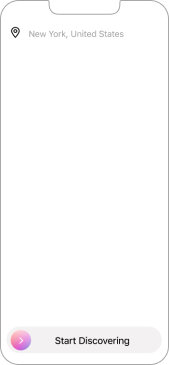
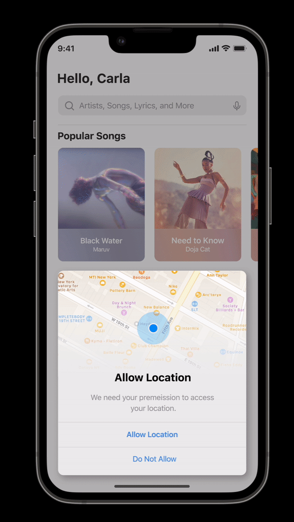
Allow location feature- The process begins by pressing “Allow Location,” prompting users to grant location access.
- Users are then asked to confirm their understanding of the button’s action and its implications.
- Once confirmed, they tap the location button to proceed.
- This action grants your app one-time permission to access their location.
- This enables the app to provide tailored services based on their current whereabouts.
Redesign
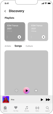
Songs
Songs
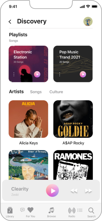
- “Songs” is the core feature of Apple Music, where users find their curated playlists and albums.
- Recommendations are based on the music users have "Loved."
- Users can easily access their favorite music.
- Music suggestions are tailored to the user's location.
- Personalized playlists help users discover new tracks and artists they might enjoy.
Redesign
Radio Station
- Discover Local Radio: Explore popular local stations based on your location.
- Personalized Suggestions: Get recommendations that match your preferences and surroundings.
- Easy Access: Integrated into the app for seamless navigation.
- Improved Listening: Enjoy curated lists for a better music experience.
- Connect Locally: Engage with community culture through featured stations.
Redesign
Events &
Concerts
- Users can access recommendations within the app, eliminating the need for a separate application.
- The app notifies users about events posted by artists they follow.
- Users receive notifications about concerts featuring their favorite artists.
- Recommendations for local events are provided based on the user's preferences.
- Event notifications include details such as venue, date, and ticket availability.
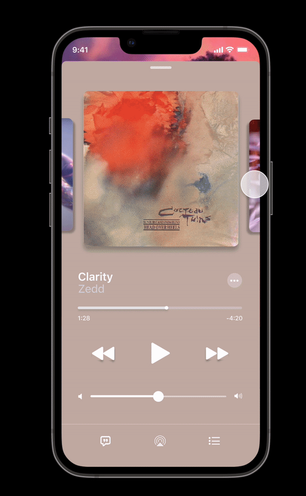
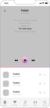
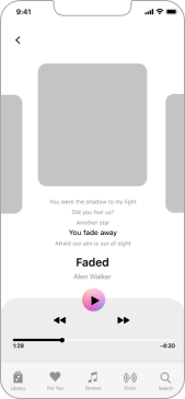
Redesign
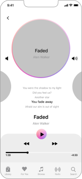
Play Music
- Users can now see adjacent songs (previous and next) for easier navigation.
- Horizontal swipe gestures enable switching between songs seamlessly.
- This new feature enhances user control over their listening experience.
- Intuitive navigation makes switching tracks more accessible than before.
- Enhancements allow for a more interactive and fluid music playback experience.
Learnings Reflections & Challenge
This project has taught me how to navigate existing product constraints and design within established systems, leveraging familiar design patterns and components.
Understanding users' needs indirectly, rather than asking directly, proved challenging yet effective in uncovering genuine pain points and crafting solutions that resonate with users' language and expectations.
Understanding users' needs indirectly, rather than asking directly, proved challenging yet effective in uncovering genuine pain points and crafting solutions that resonate with users' language and expectations.
© 2025 Carla Pan | All design works submitted under the professional name "Carla Pan". Legal name: Yu Pan.