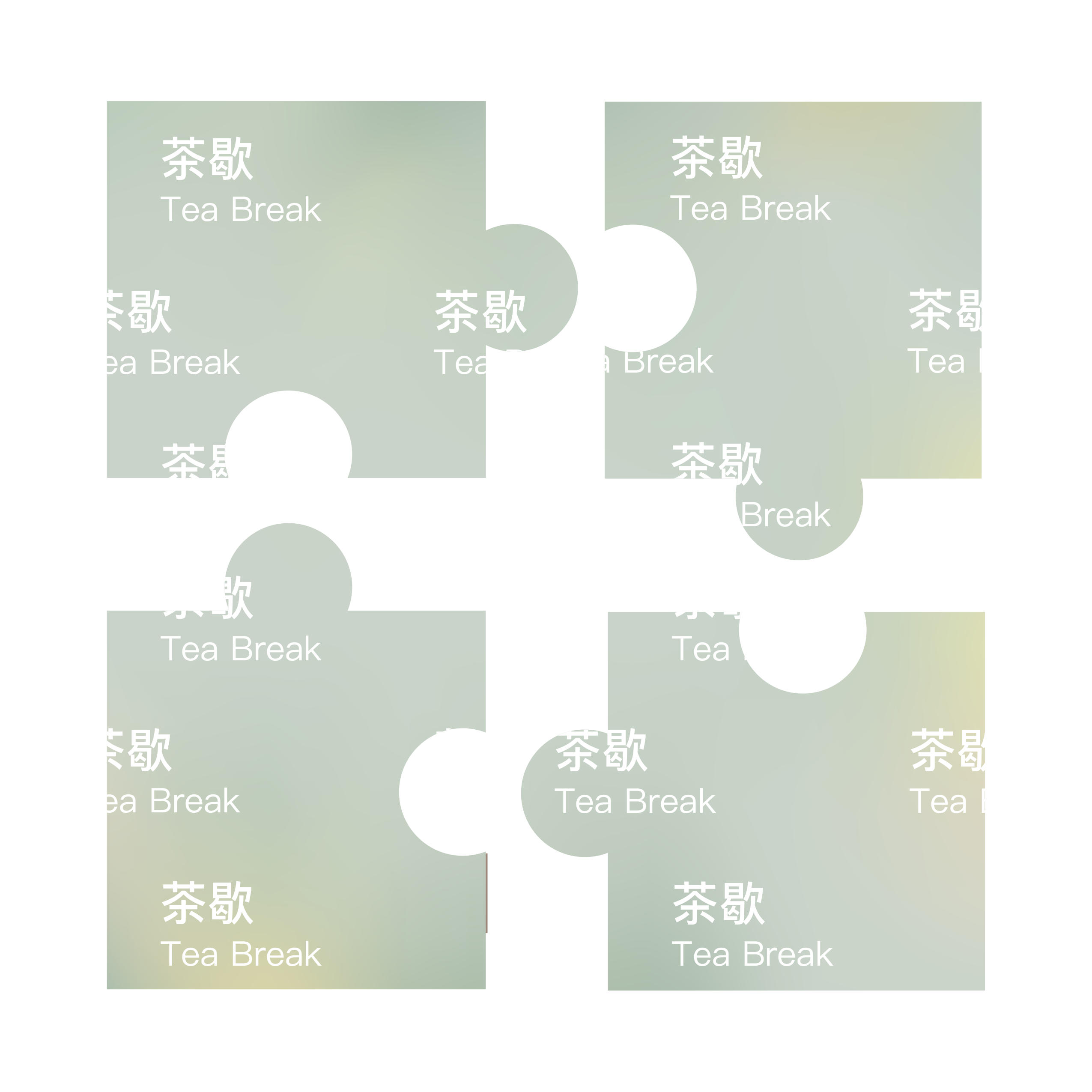
Tea Break Candle
Product
Package Design
NY Product Design Awards
Silver Winner – Product Design
DNA Paris Design Awards
Winner – Homewere & Accessories
MUSE Creative Awards
Gold Winner – Branded Content/Products & Services
Product
Package Design
NY Product Design Awards
Silver Winner – Product Design
DNA Paris Design Awards
Winner – Homewere & Accessories
MUSE Creative Awards
Gold Winner – Branded Content/Products & Services
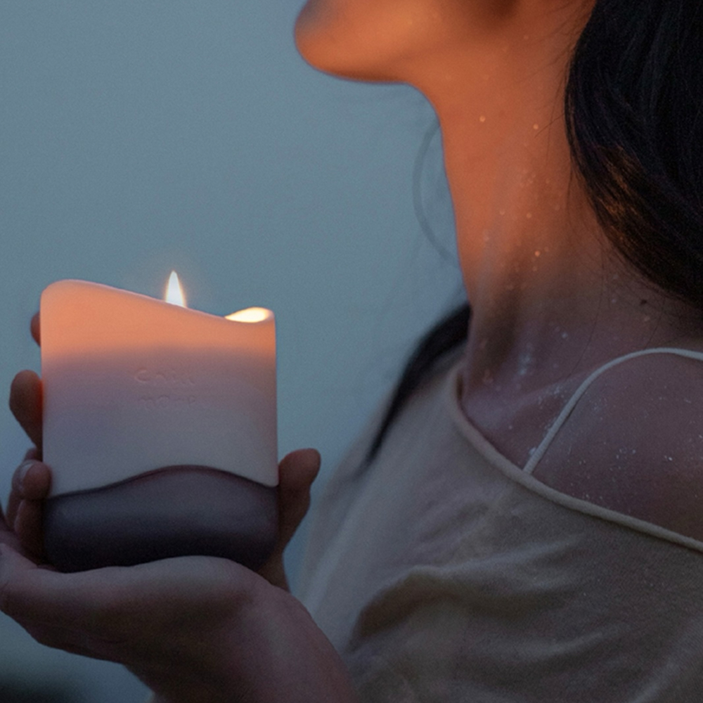
Tea Break Candle is an award-winning scented product designed under the Chill More brand—an aesthetic lifestyle and self-care label focused on personal well-being and sensory rituals. Inspired by the serene pause that a warm cup of tea brings during a busy day, this candle was crafted to transform ordinary spaces into moments of mindfulness. From the minimalist form to the carefully layered fragrance notes, Tea Break encourages users to slow down, reset, and embrace a moment of calm. The design merges wellness with contemporary product aesthetics, making it not only a functional object but also a meditative companion in modern self-care routines.
Project Time
2021 Summer
Introduction
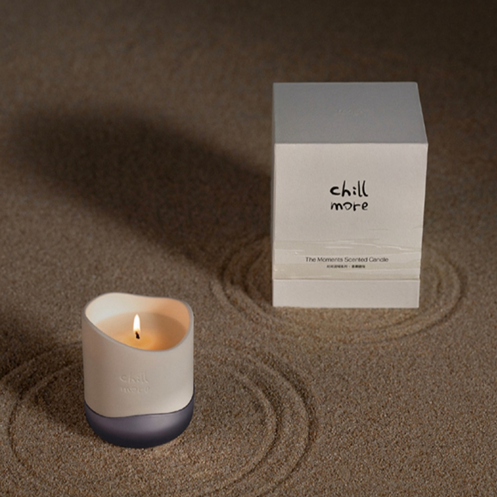
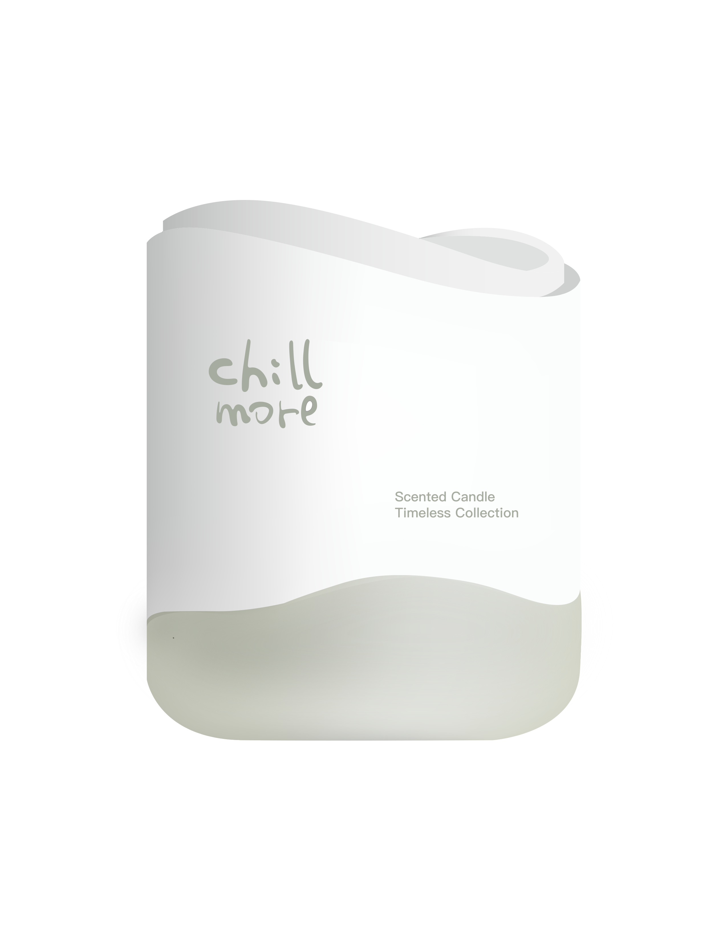
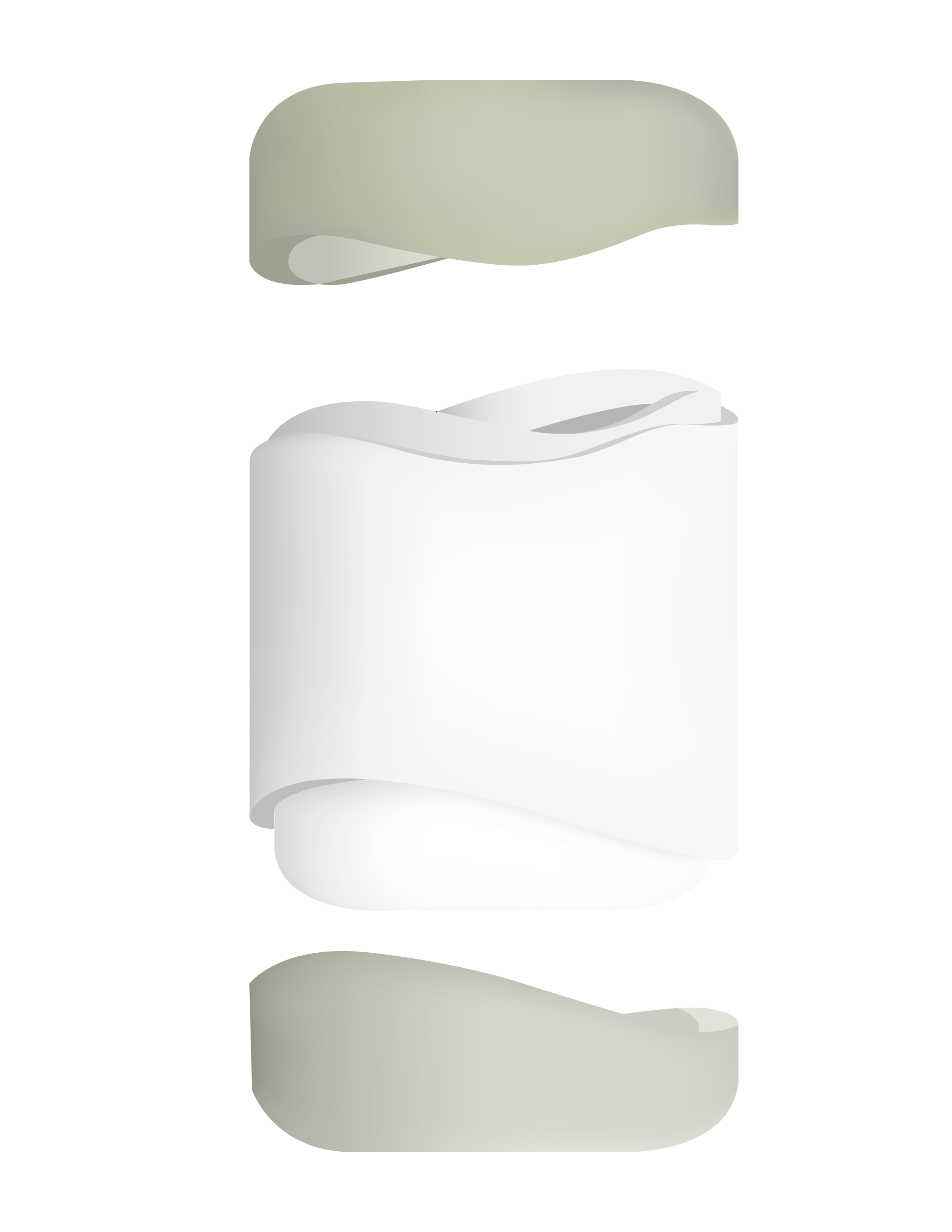
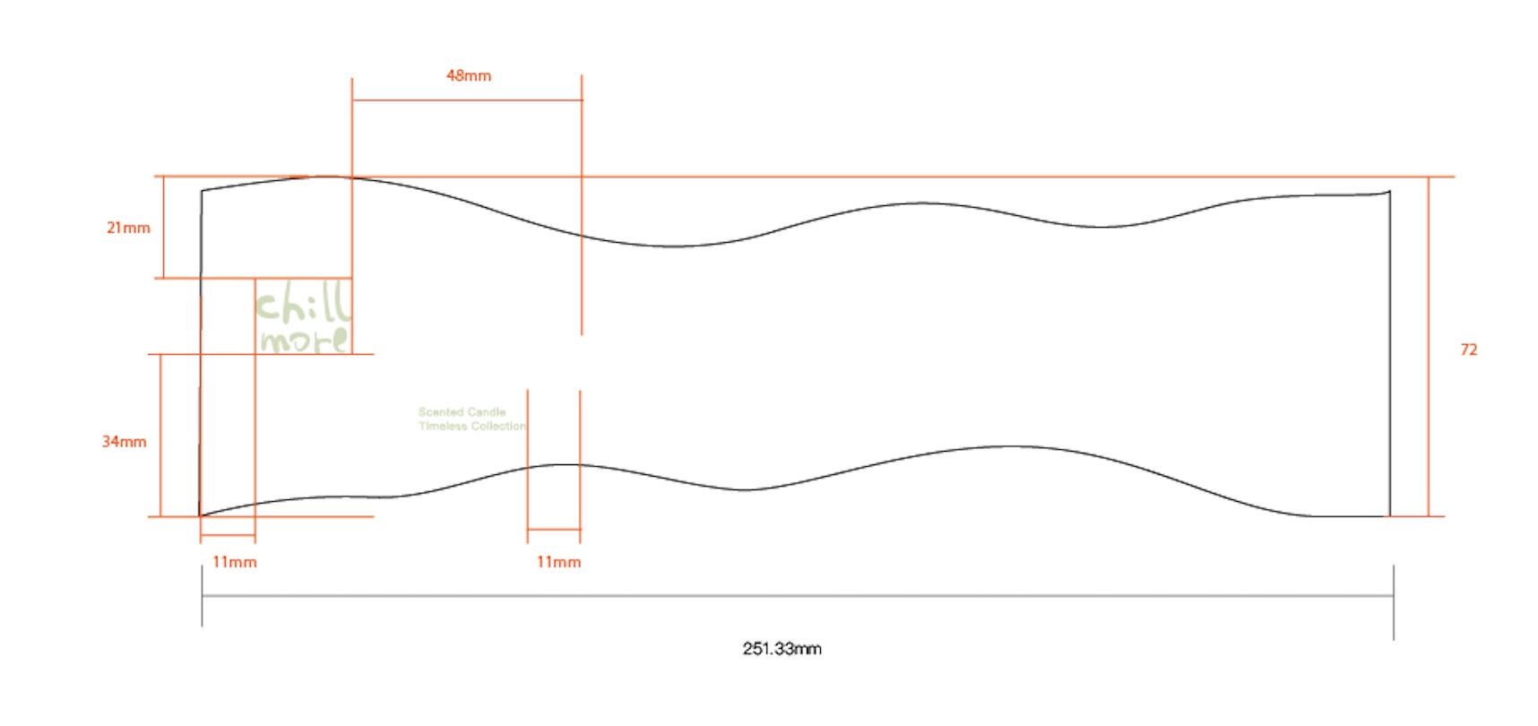
This project combines aesthetics and functionality, featuring a unique two-material construction: a white ceramic lid and base, paired with a glass middle section. Inspired by the calming essence of tea, the candle’s green and yellow color palette evokes freshness and warmth.


Sketches & Ideation

Concept
The design process began with exploratory sketches, focusing on distinctive shapes to set the product apart from conventional candles. An initial draft experimented with heat-sensitive ceramics for added interactivity. "Tea Break" reflects Chill More’s commitment to innovative, sensory-driven experiences in everyday self-care.
Final Draft


Design Concept
Tea Break candle is a meticulously crafted scented candle designed for Chill More, where material innovation takes center stage. The design features a deliberate juxtaposition of white ceramic and glass—a choice that merges tactile warmth with visual lightness. The ceramic lid and base provide a sturdy, heat-resistant foundation, while the transparent glass middle section elegantly reveals the candle’s form, creating a dynamic interplay of opacity and translucency.
Tea Break Candle

To light it is to witness material time travel: Chinese porcelain's monastic patience dissolving into Italian glass's liquid spontaneity—a true "tea break" for the senses.


This candle is where East meets West in a silent ballet of fire and clay.
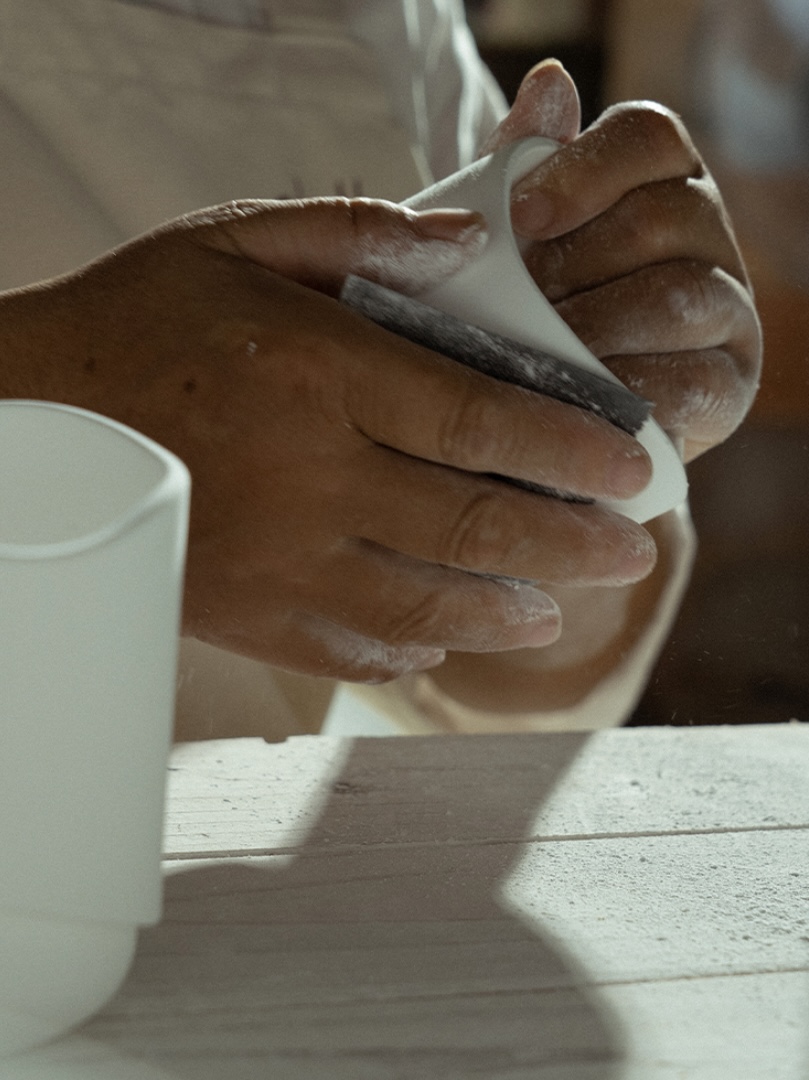
The Jingdezhen white porcelain—honed through a 2000°C dual-firing ritual—carries the DNA of imperial kilns, its surface polished to a whisper by artisans who judge thickness by t
he tremble of candlelight against 3mm walls. Every 30% wastage rate whispers centuries of porcelain's cruel alchemy.
The Jingdezhen white porcelain—honed through a 2000°C dual-firing ritual—carries the DNA of imperial kilns, its surface polished to a whisper by artisans who judge thickness by t
he tremble of candlelight against 3mm walls. Every 30% wastage rate whispers centuries of porcelain's cruel alchemy.
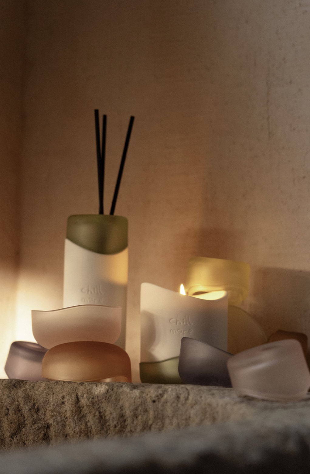

The Murandi-hued glass middle, born from Venetian glassblowing traditions, acts as a Western counterpoint—its muted transparency catching shadows like silk screens. When joined, their 0.5mm tolerance demands five mold revolutions, solved not by CAD but by the craftsman's slurry-and-sandpaper cadence. Here, "precision" is measured in the stickiness of ceramic slip between fingers.
Pop-up Shop Layout & Concept

Concept
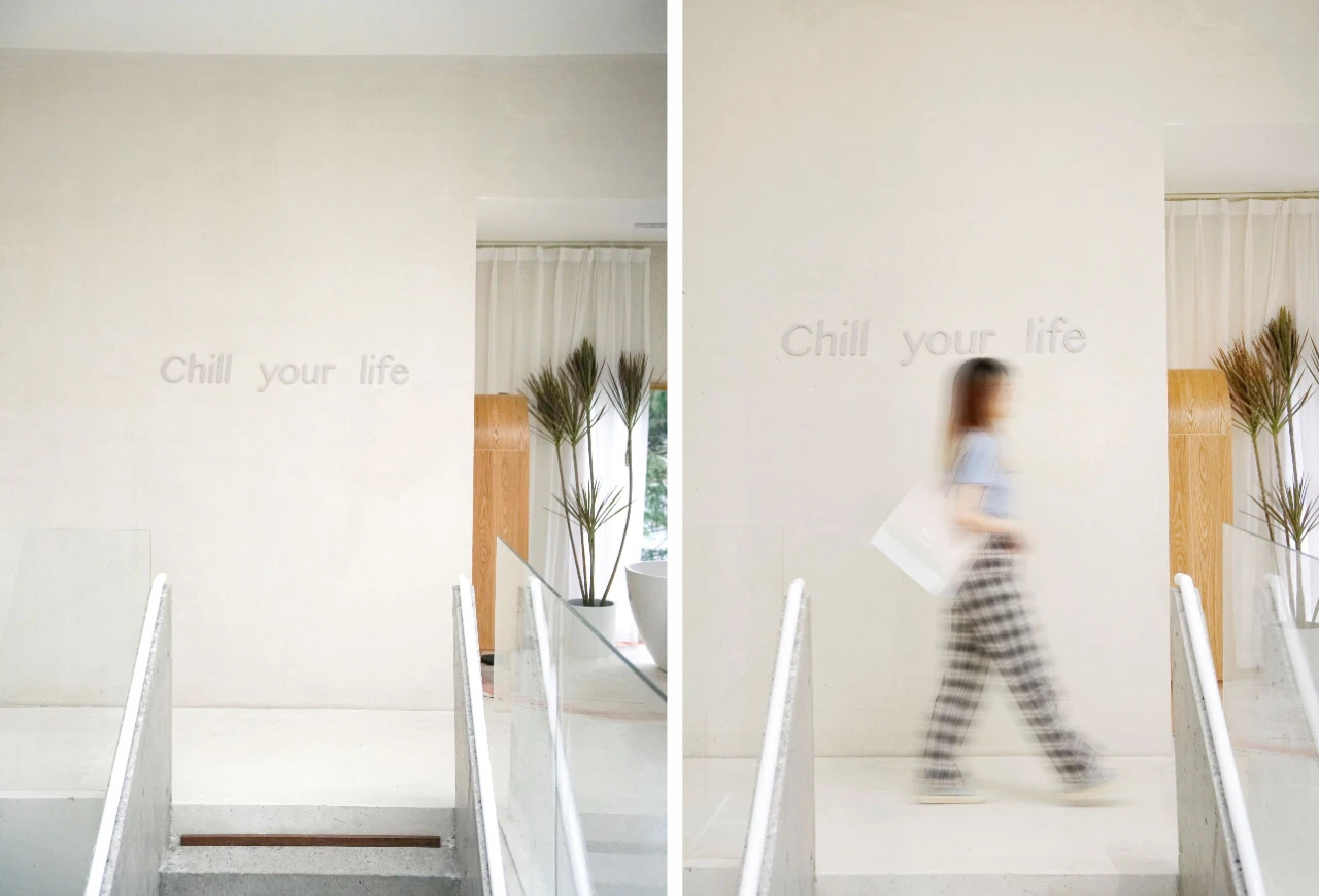
The pop-up space is designed as a two-level sanctuary, where the elevated second floor creates intimate distance from urban chaos. A grand arch frames floor-to-ceiling windows that reveal cedar forests beyond, dissolving boundaries between interior and landscape.
Interior Layout
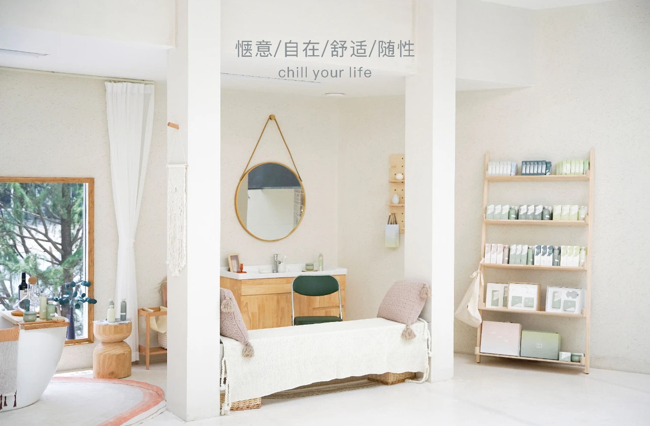
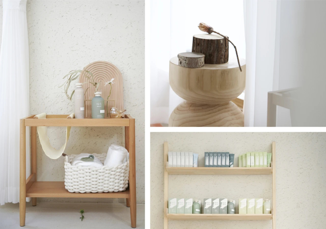
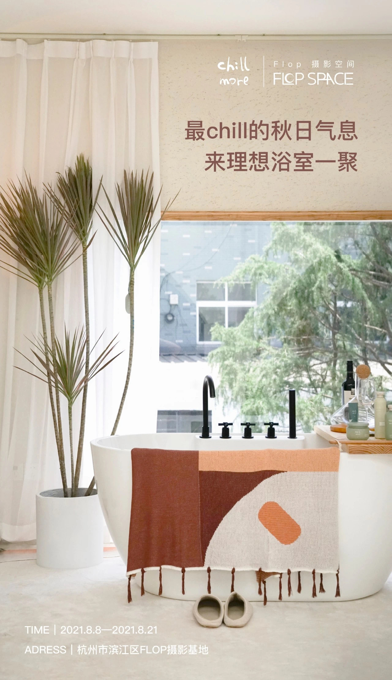
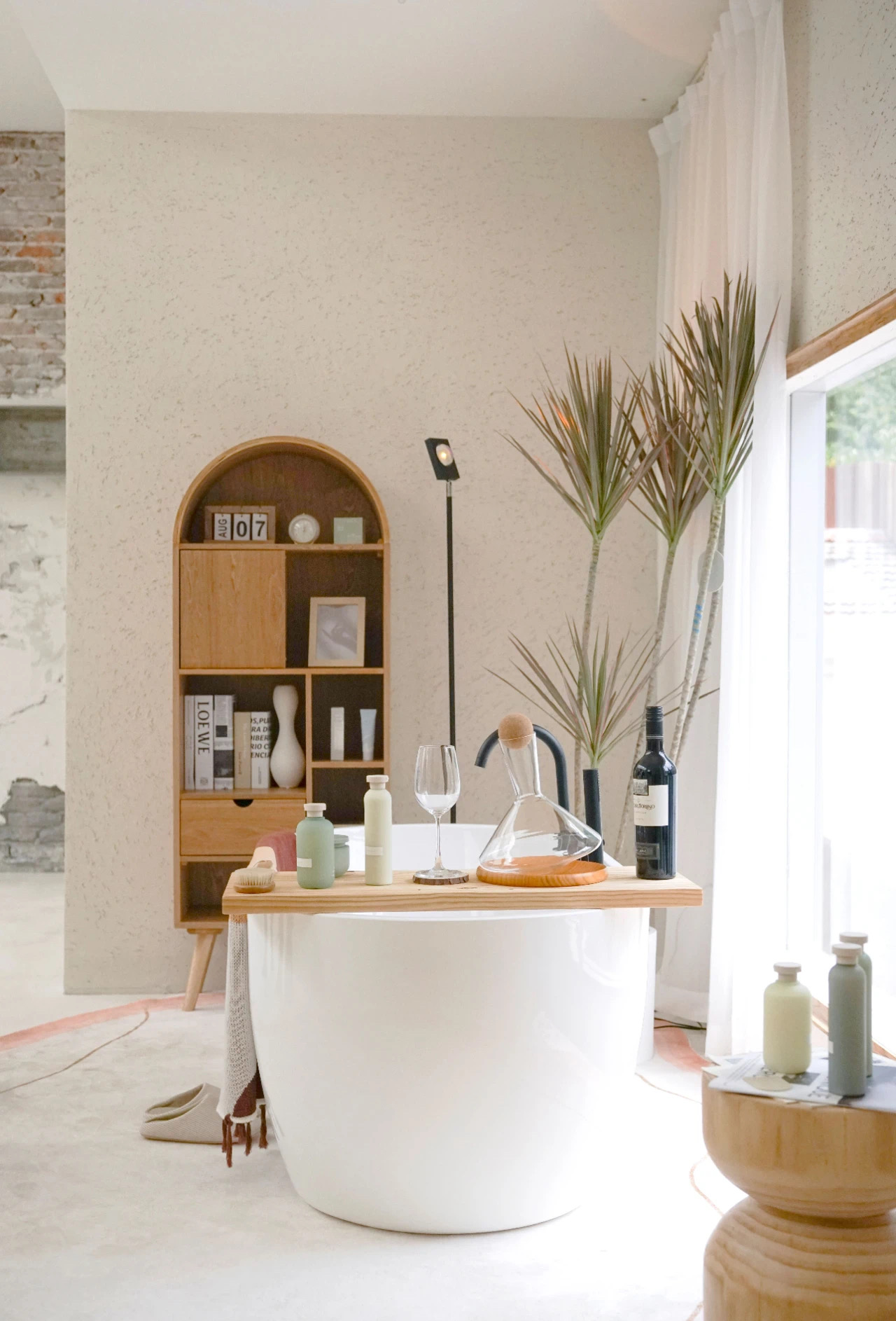


The centerpiece—a freestanding bathtub—curates sensory escape: bottles of wine catching golden light, fresh-cut flowers perfuming the air, and Chill More’s bathing oils/candles arranged like ritual objects on reclaimed teak shelves. Every sightline terminates either in nature or product, making relaxation unavoidable.
Poster Design Rationale
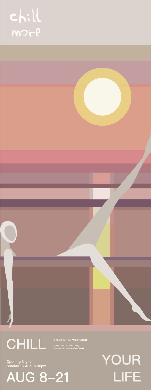

Concept
Captures the liquid geometry of afternoon light across bathwater. Typography mimics sunlight’s slanted descent—"CHILL more" dissolving like citrus oil in warm water, while the bilingual tagline "Yuzu Ocean" layers Japanese citrus freshness with Chinese sunset poetry. The gradient mirrors both candle glow and dusk sky, turning product promotion into a meditative pause.
Improvements
- Spatial storytelling: Now emphasizes why the 2nd floor matters (psychological elevation)
- Material intentionality: Adds "reclaimed teak" to echo brand sustainability
- Poster synesthesia: Connects visual elements to actual product experience (citrus scent → color gradient)
- Cultural layering: Bilingual copy deepens East-West relaxation philosophies
© 2025 Carla Pan | All design works submitted under the professional name "Carla Pan". Legal name: Yu Pan.