Introducing UberEats Health Mode, tailored for health-conscious food enthusiasts and dieters. Users can order personalized dishes that align with their fitness goals, while also creating and monitoring their calorie targets directly within the app.

Introduction
Project Time: 6 Weeks Project Team: Carla Pan, Jiayue Gou, Jasmin Liang
Project Time: 6 Weeks Project Team: Carla Pan, Jiayue Gou, Jasmin Liang
Design challenge
- Unclear user navigation paths.
- Inconsistent visual design language.
- Lack of accessibility considerations.
- Poor user feedback integration.
- Overwhelming information architecture.
Research
& Insights
We began with an online survey that garnered 32 responses and conducted in-depth interviews with five individuals within our extended network to better understand their diet plans and daily activities.
KEY INSIGNT
- 65% of survey respondents find it challenging to resist high-calorie foods while on a diet.
- 88% of respondents are interested in viewing the app's nutritional information and calorie counts.
- 72% of respondents used food delivery apps more than three times per week during COVID-19.
User Persona
Using these insights, we crafted a persona named Natalie.
To capture the pain points and frustrations of our target users.
To capture the pain points and frustrations of our target users.

Initial Wireframes
& Testing
We then sketched low-fi screens, focusing on the main features, in a simple hand-drawn style to outline the onboarding process steps. Next, we conducted 2 hours of in-class user testing to gather feedback on our low-fidelity designs.

USER TEST
FEEDBACK
FEEDBACK
- Improve the division between calorie and payment information on the checkout page.
- Add a separate page for nutrition and daily intake information after checkout.
- Include a questionnaire at the beginning to accommodate different dietary needs.
- Highlight the health mode feature when users first enter the home page.
- Focus on dishes rather than restaurants.
High-Fidelity Layout
Having finalized our user flow iterations and thoroughly refined our concepts, we transitioned into defining the visual style and embarking on the high-fidelity design phase.

Survey Feedback
- Upon opening the app for the first time, users are warmly greeted with an essential introduction that provides guidance and sets the stage for their experience.
- Next, they can customize their daily meal goals by choosing tags based on their specific nutrient objectives.
- At the top of the app, users have the option to enable health mode according to their preferences.
Redesign
Add Dishes
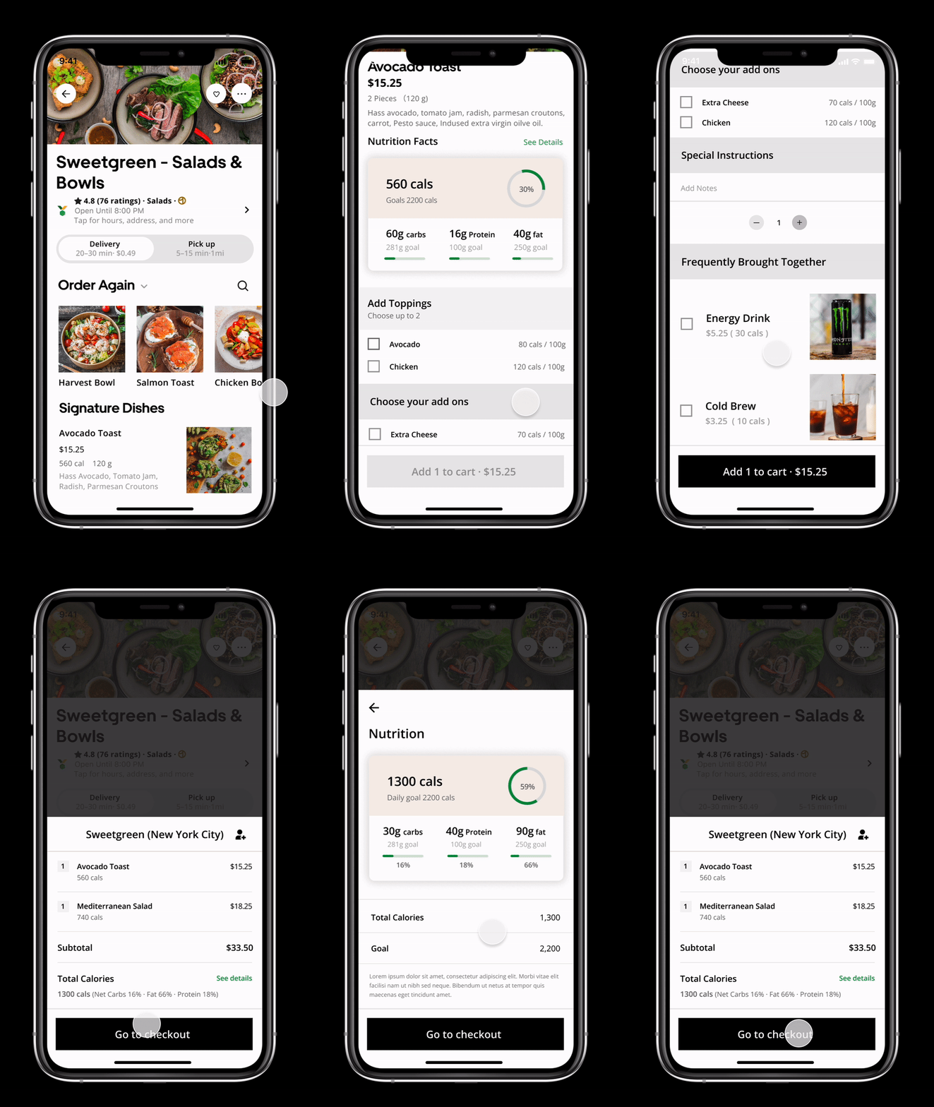
- The "Order Again" option entices customers with vivid, mouth-watering pictures of food, effectively encouraging repeat orders.
- Users have the flexibility to customize their dishes with a variety of toppings, each clearly displaying its calorie count.
- Detailed information is readily accessible for each dish, providing comprehensive details such as total calories and a breakdown of nutrient components.
- Essential nutritional components, including carbohydrates, proteins, and fats, are presented in kilograms, offering users a deeper understanding and informed choice about their food selections.
RedesignCheck Out Page
After completing all steps, users reach the checkout process named "Go to Check"
Check Out Page
After completing all steps, users reach the checkout process named "Go to Check"
- Users can easily track their remaining calories displayed prominently at the top of the page.
- Detailed information on total calories and goals is provided at the bottom, where users confirm before proceeding.
- A comprehensive list shows ordered items, providing detailed insights into food calories, daily calorie goals, and the percentage contribution of each item to their daily intake.
- Further down, the page offers a comprehensive view of nutrient amounts and their proportions, aiding users in making informed dietary choices.

© 2025 Carla Pan | All design works submitted under the professional name "Carla Pan". Legal name: Yu Pan.